
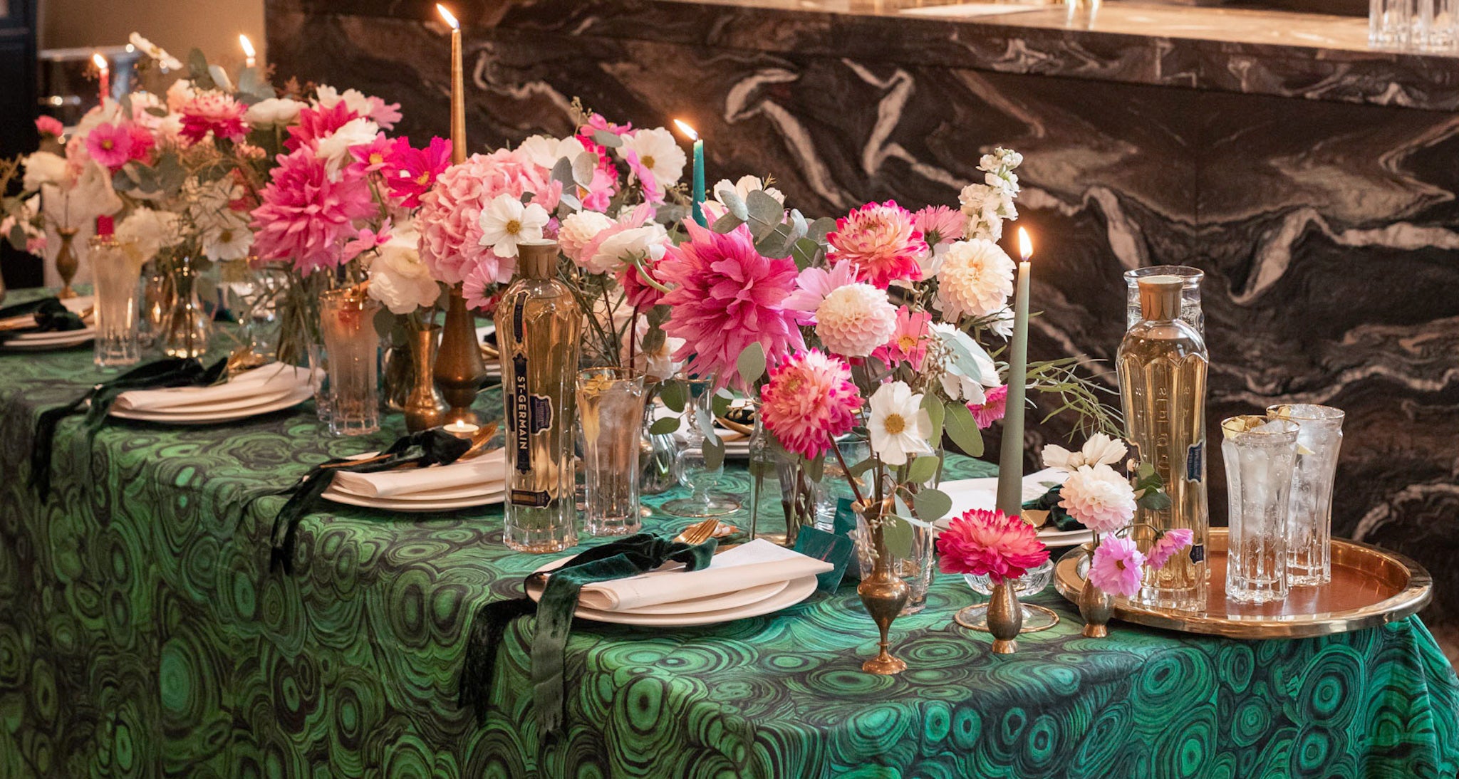
This event was a (sold out!) tablescaping masterclass with ST~GERMAIN at The Londoner hotel. All proceeds from ticket sales were donated to The Drinks Trust. I created a table to transition the seasons: deep teal with pops of pink and flashes of gold. Autumn isn't just rusty reds and pumpkin oranges after all!

Set The Table
Glamorous Autumn Tablescape
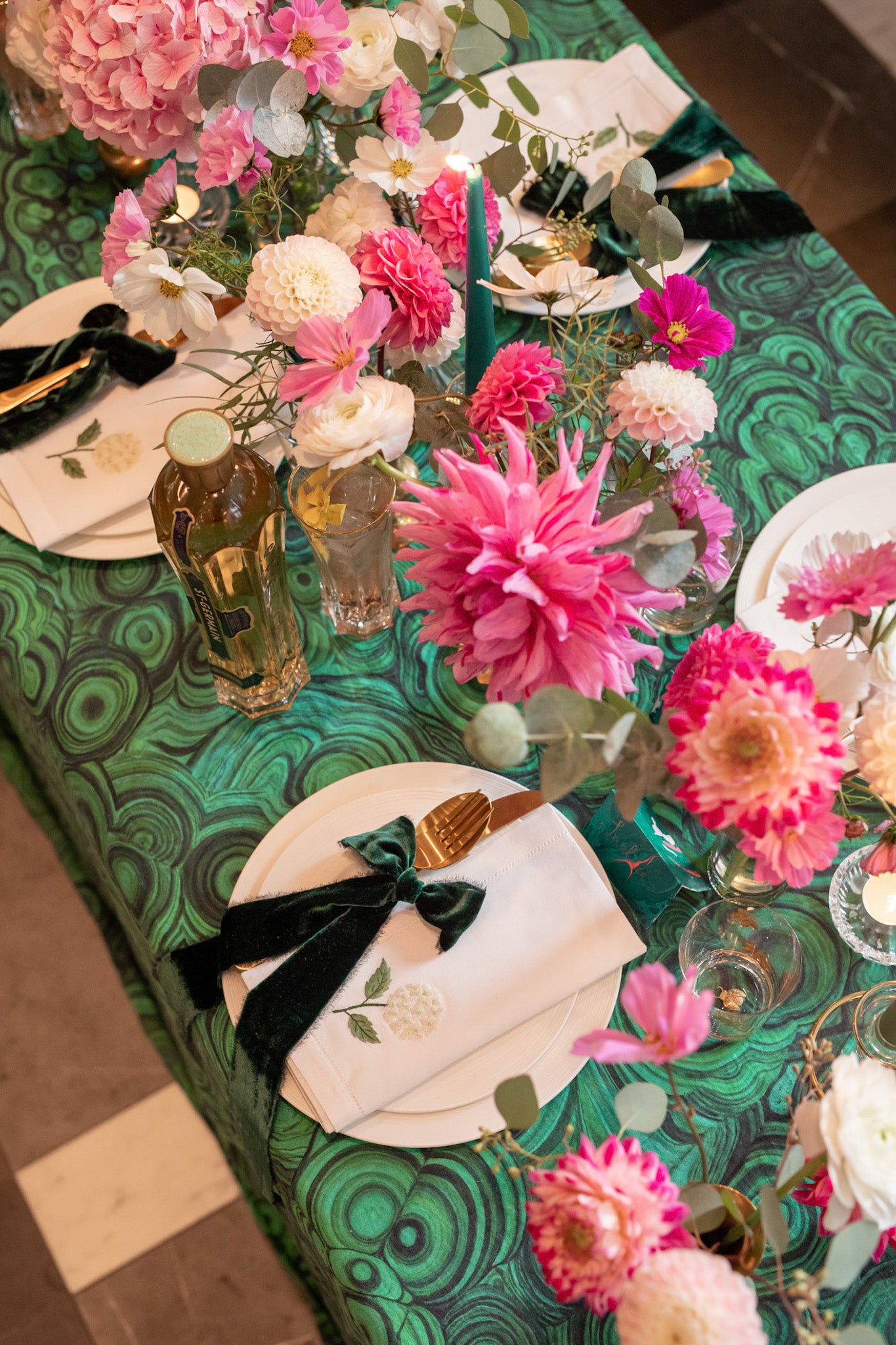
Autumn and Halloween needn't always be orange, amber and black. This tablescape marked the transition through the seasons, taking the teal, green, pink and gold from the ST~GERMAIN colour palette as inspiration. These colours might not be traditional to autumn but they bring an elegant, elevated take on a typical table for this time of year.
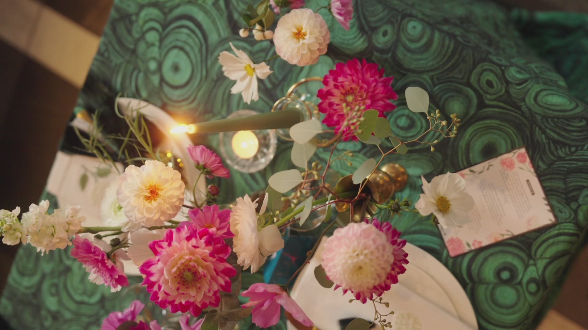
I fell head over heels for this tablecloth by Summerill & Bishop. The print is based on the malachite - a mineral known for transformation and times of transition.
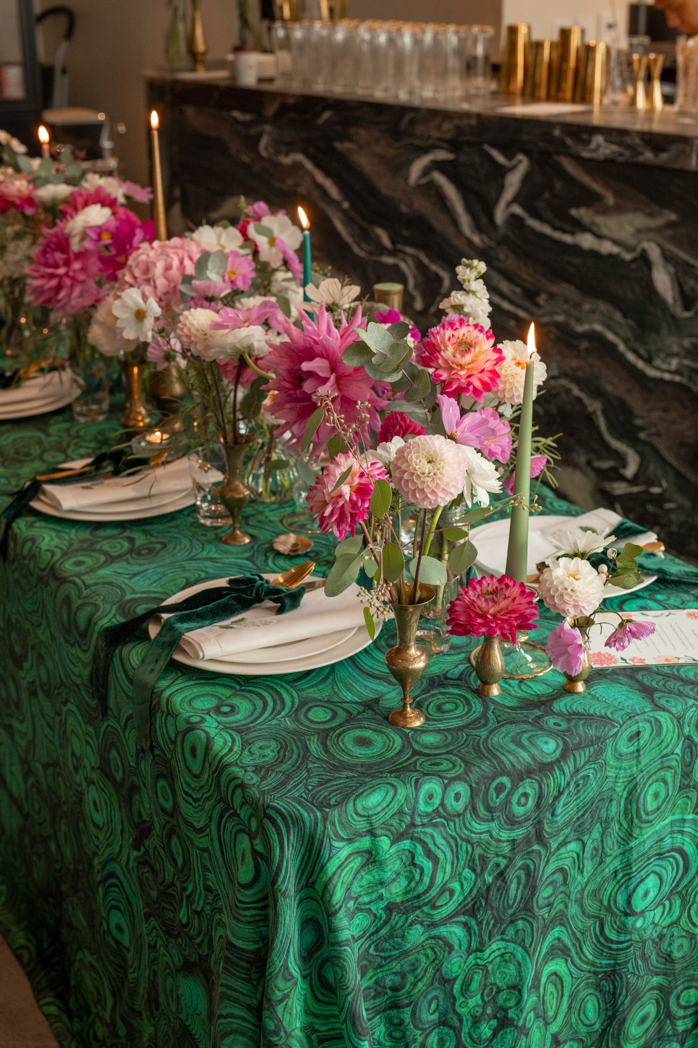
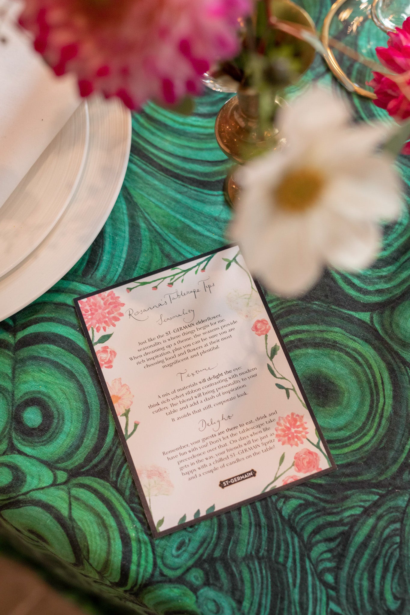
For flowers, I used the first of the hanoi ranunculus (you know how I love these), with the last of the dahlias and cosmos. I painted these same flowers onto postcards of table tips that all the guests took home.
"It was really special to meet guests at this sold-out tablescape workshop. We covered everything from colour palettes to the ultimate menu. Not to mention my first ever live ribbon workshop (I loved what everyone created!)"
Credits
Napkins, firefly glasses and votives: Bonadea
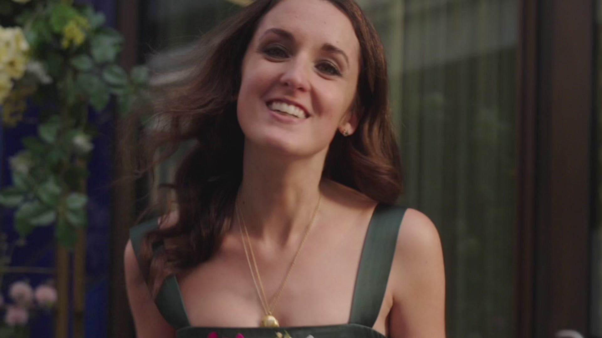
Dress: Alice Archer
Tablecloth: Summerill & Bishop
Candlesticks: Ibbi Interiors
Floral installation: Wild at Heart
Photography: Georgia Meramo
Videography: Clay Films
* Part of a paid partnership with ST~GERMAIN
Read More

Redecorating Our Bedroom
The last room in our London house is finally ready...

Modern Floristry Class
A different kind of floristry for a masterclass at my pop-up with Smock London.

Interview with CNN News18
An interview on block printing, craft and the meaning of 'home' with Surbhi Pathak for CNN's News18.

Pink Jaipur Blossom
Rani pink against crisp white cotton - the making of the second part of the Jaipur Blossom collection.